|
As watercolor artists we are working on a two dimensional surface, but trying to convince the viewer that they are looking at a three dimensional picture by using texture, value, and form. Saran wrap and Waxed paper both give unique textures to your watercolors. With Saran wrap the effect will change depending on how long you leave it on the paper. For a subtle textures, take the saran wrap off the paper when it is not completely dry. If you allow it to dry completely the Saran wrap will leave a more geometric pattern. I have always used Saran wrap for background textures in my Still Life paintings. A color like Raw Sienna used for the background with saran wrap that is lifted off before the paint dries gives the effect of a hand plastered wall, perhaps in Tuscany. Waxed paper gives a very different textural effect. With waxed paper, do the same procedure, but put something heavy on top to hold the waxed paper down. Try both and see which one you like. Procedure: Draw image in pencil on watercolor paper. Wet paper. Flow on your choice of watercolors. Gently press the Saran wrap into wrinkles on the paper. The paint must be wet when you first put the Saran wrap or waxed paper on. I love experimenting and wondered how it would look if I used the Saran wrap on the object (in this case the pear,) not the background, and I am very happy with the way it came out. Please enjoy the video. Let me know how it went for you.
0 Comments
"The sky, a perfect canvas, offers clouds nonetheless. They shift and drift and beg interpretation...such is the nature of art."- from Jeb Dickerson I have always enjoyed looking at clouds. When we are day dreaming, or as children, we may see them as animals or a fantasy scene. One moment they are there and then they are gone. We look at clouds to see what weather is approaching. Watching the clouds as they move, come together, and are blown across the sky is fascinating. We just have to slow down enough to look up, and appreciate their fleeting beauty. Many songs, poems, and stories have been written about clouds: Both Sides Now by Joni Mitchell, "I wander lonely as a cloud," from a poem by William Wordsworth, and the childrens' story, Cloudy with a Chance of Meatballs, by Judi Barrett. Watercolor is the perfect medium to portray clouds. With it's transparence, and wet-in-wet possibilities, it is easy to capture the softness of clouds. Techniques: Be sure to have plenty paint mixed up in the mixing area of your palette. Load up your brush with color before you begin on your wet paper. I suggest blue, a mixed grey, and whatever else you might need. I like to mix my greys to add depth and interest to the painting. Raw Sienna is my favorite for adding a warm yellow color to skies. It does not turn green when added to blue like most yellows do. I prefer to use granulating colors like Ultramarine Blue and Manganese Blue in my wet-in-wet skies. Even though I usually have a photograph of clouds to work from, I do not try and copy that image. Instead, let the paint show you where the clouds belong. "Why do I love clouds? Because you can't save a cloud like you can save a leaf or a rock- clouds are now." from Terri Guillemets I hope you enjoy painting clouds. Until next time... Some of these greys used in a cloud scene. A stormy day on the ocean. 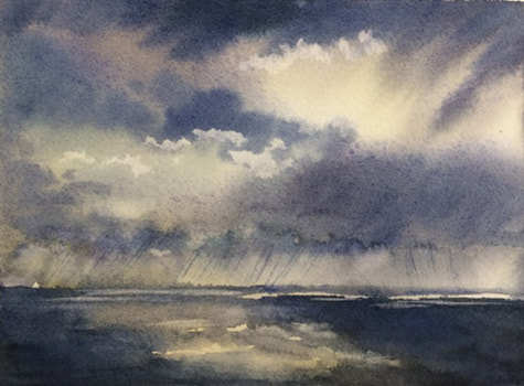 I prefer to mix my own greens, greys and blacks. A mixed color will be more personally yours, and it will have more depth, especially when applied to wet watercolor paper, as it will separate out into the colors you used when you mixed it. If I want an olive green I use a warm blue, such as Ultramarine Blue and a warm yellow such as Cadmium Yellow Medium or Deep. If I want a fresher green I would use a cool blue such as Thalo Blue and Lemon or Winsor Yellow. One of my favorite greys is Ultramarine Blue and Cadmium Red Light. Blacks can be made by combining the three primary colors: Red, blue and yellow. or Burnt Sienna and Ultramarine Blue. There are many combinations to try. Be sure to put your samples in your sketchbook and write down what colors you used so you can repeat the formula when you need it. Here are some the the greys I tried before I did this cloud painting. Mixing Greys Chart. 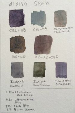 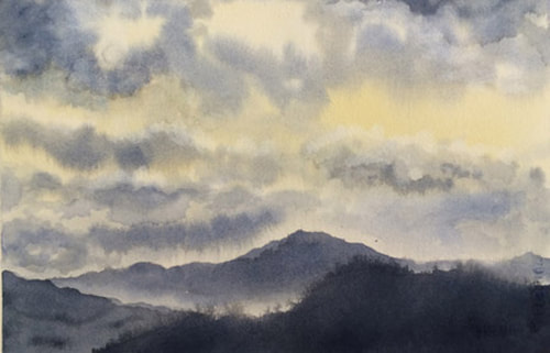 Rain in the mountains. 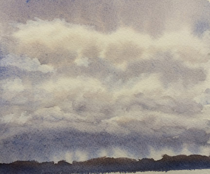 I painted around the clouds and also did some lifting.
Art tip #5 When deciding on the colors to use for a painting, it is a good idea to consider the color scheme in regards to warm and cool colors. Decide if the color scheme is to either be mostly warm colors with a smaller amount of cool, or more cool colors and a smaller amount of warm. Having a dominance of warm or cool can help you create a mood for your painting and may help you express the feeling you had when you first saw it. Blues and greens can create a calm feeling, dark cool colors a somber mood, lively colors in reds and yellow are colors that can make you happy when you look at them. You can see the warm and cool colors on the color wheel: the side with the red and warm yellow is warm, and the other side with the blues and greens is cool. Each primary color will also be categorized as warm or cool. It is helpful to make a chart in your sketchbook, divided in half, of all the colors, having one side for warm and the other side for cool. When you add a new color to your palette, add a sample of this color to your list. Usually, a color that has a little red added to it will be warm, and a color with blue or green in it is cool. As an example, Ultramarine blue has a little red added to the formula, while Thalo Blue has a little green added. 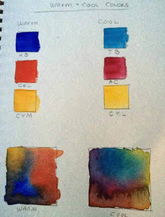 UB- Ultramarine blue TB- Thalo Blue CRL- Cadmium Red Light AC- Alizarin Crimson CYM- Cadmium Yellow Medium CYL- Cadmium Yellow Light  This painting is mostly warm. It has a very different feeling than if I had used the more typical blues, greens, and violets for this scene. I used Ultramarine blue, Alizarin crimson, Cadmium red light, and Cadmium yellow light. 
Art tip #6 Tints: Most watercolor painters use water to lighten the hue of their paints rather than opaque white watercolor or gouache. It is helpful to make a chart in your sketchbook that shows the tints of each color. This allows you to see how light a color can become and will help you in choosing your colors for your painting. One example is Cadmium Red Light. It is very intense when used right out of the tube, but when diluted, it is a beautiful, soft peach color, which I use quite often in portraits. Try tints of all your paints in your sketchbook for a great reference tool. 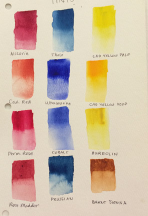 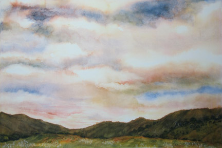 "Looking Towards Willits."
Watercolor pencils are fun to use and are convenient to use when sketching on location. By just bringing a kit with a set of 12 watercolor pencils, an Aqua Brush that holds water and eliminates the need to carry water, a pencil, and a sketchbook, you can do your watercolor painting anywhere easily. Watercolor pencils will add texture to your painting if you use cold pressed paper, due to the roughness of the paper. You can use them several ways: 1. Draw the scene in watercolor pencils, and then add water with your brush. Rinse the brush when you go to a different color to keep the colors fresh. 2. When the paper is wet, draw with the watercolor pencil. It will be a deep, rich color, but will be very difficult to remove or change. 3. Hold the pencil color you need and wet it with the brush, then paint as you would regular watercolor. The effect will be smooth like using tube colors, but usually lighter. 4. Draw with watercolor pencils over an existing watercolor to add texture, detail or depth. ( Especially good for animal fur.) Then add a small amount of water as needed, or leave dry, like a colored pencil. I decided to do two paintings in watercolor pencils, using paintings done in tube colors as my examples, to see how they would be different. I found I liked the texture I got from the pencils, and they were very different than the originals. After drawing the subject in watercolor pencils, I wet the color and lightly blended it before letting it dry. Then I added another layer of pencils, re-wet, and added the details with the pencils while wet, for bold color. I did some scraping with the back of my brush handle for more texture. I also like using watercolor pencils for trees and plants. I draw them with the pencils and then add water with the brush. 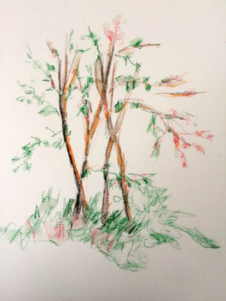 Watercolor Pencils. 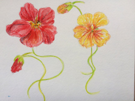 Watercolor Pencils.  Experimenting with watercolor pencils. 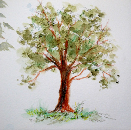 The watercolor pencils give great texture to the tree. Keeping a Nature Journal Keeping a Nature Journal: I recently taught a weekend workshop on nature journaling in watercolor to about twenty women. We used watercolors, watercolor pencils, fine point marking pens and pencils. By being outside and recording our observations and thoughts on nature, we become a lot more observant and learn more about our surroundings. You can record what you see, what the weather is like, what birds you hear, and how you are feeling as you walk. You can use your nature journal to record your experiences at a certain location you like to visit, or when you take a trip and experience new surroundings. Be sure to include the date, time and location on each page, and something about what you saw or how you felt. A sketchbook can be a catalyst to learning more about what you observed, and with your sketch in hand, it will be easier to find answers to any questions you may have about what you saw. You can divide the page into different sections to hold text or a closeup of what you are drawing, or an overall view. It is nice to include small samples of the colors you used on the page, for reference later, if you want to do a larger painting from this sketch. For watercolor it is best not to use any paper less that 90# or the pages will wrinkle when you get them wet. I like a spiral bound sketchbook, but a bound sketchbook may be your choice. There are many sizes and shapes to choose from. It is best to keep your journal somewhere that is easy to access, and dedicate time to working in your journal. Try to record your thoughts when you are out, rather then relying on your memory when you get home. When doing your drawings remember that it is not about making perfect renderings-- it is about observing and gathering information. Your drawing will get better with time and practice. Choose your own style, and don’t censor yourself in your writing or painting. Just let your thoughts and brush flow freely. 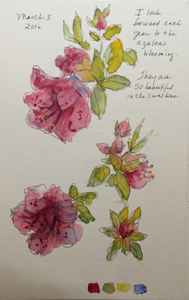 Azaleas in my garden. 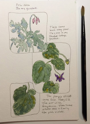 Early spring in the garden.  From my nature journal. 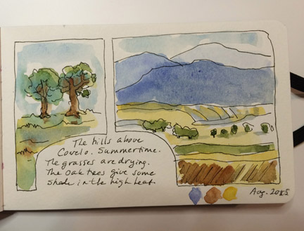 From my nature journal.
An Analogous Color Scheme For a color scheme that helps to unify your painting, try analogous colors. Because the colors are next to each other on the color wheel they relate to each other harmoniously. Three to six colors is a good amount. Try drawing several squares in your sketchbook and, after wetting the area in the square, charge various analogous colors that you would like to try. For this painting I did two small studies before my final painting. I used red-violet, violet, blue violet, blue and blue-green.  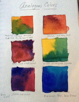 In the classroom at my Mendocino College watercolor class. 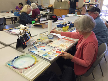
Welcome to my art blog. I have been thinking about creating this for a long time, and have been looking forward to sharing it with you. I have enjoyed teaching art to all ages in Mendocino county for over 30 years. Watercolor has always been my first love in art mediums, followed by pen and ink, and printmaking. I also enjoy creating wearable art silk scarves. Painting with dyes on silk can be very similar to wet on wet watercolor painting. Currently I am teaching watercolor for Mendocino College in Ukiah, and Willits, California. It is a great joy to share watercolor with people who are just beginning in the medium, or more advanced artists who need motivation to keep them painting. Watercolor can be unpredictable, and challenging, but very rewarding, and that is what keeps me motivated. You never really know for sure what will happen when you start your painting session. Sometimes my favorite part is a mistake that I wasn't expecting, which, when dry, turned into something more beautiful than I could have created if I had tried. Each month I will be sharing some of my favorite art tips. Brushwork, Leaves and Flowers Exercises. If you have not painted in awhile, or just want to warm up, a brushwork exercise is fun. If you let your brushes do the work for you, watercolor is much easier. The two brushes I use the most are a 1” flat aquarelle with a clear beveled handle, and a #12 synthetic round. Good choices for the aquarelle are Connoisseur and Princeton. My favorite synthetic brushes are called Beste, and I have only found them at Jerry’s Artarama online. These brushes come to such a great point, that I do not have to switch to a detail brush to complete my painting. 1. I like to experiment with fences, lifting, waves, brick shapes and dry brush. The flat brush is used on the left, and gives a very clean, sharp edge. The beveled brush handle can be used for scraping (scraping semi-dried color off the paper to make white lines), and bruising (bearing down with the brush handle on wet color, to make dark lines) A drier brush will make grasses. The round brush can be used in the same way but will give softer results, and is great for leaves, foliage, and flowers. These exercises will help you choose the right brush for your painting needs. 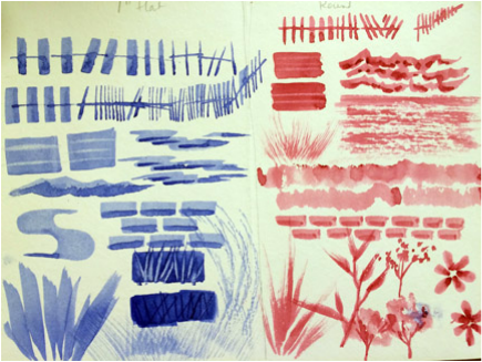 2. Double loading the brush with wet color: Load the brush with light green then put the tip in dark green and paint one side of the leaf and then the other side. Orchid shapes are fun to try and well as other leaves and flowers. Only the round brush is used here. 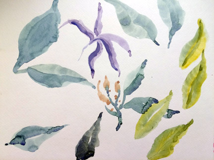 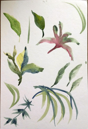 Ways To Apply Watercolor A good watercolor sketchbook is essential for doing any exercises, or for your daily sketching, and it should be at least 140# paper. I like a wire spiral binding, but look for a book that opens flat. Strathmore or Canson make good, basic watercolor paper, and there are many sizes of sketchbooks available. I like their Visual Journal. I use Arches 140# watercolor paper for most of my paintings. In planning your painting,the amount of water you use in your paint is going to make a big difference in your results. 1. Wet on wet is my favorite way to start a painting, wetting the paper and then putting in free flowing color. After letting the painting dry, I can re-wet the paper with a brush or water sprayer and add more color if I need it. This is a good technique for clouds. 2. I usually add the next layer of color wet on dry, which is known as glazing. This method offers a lot of control, and you can layer many times, each time drying in between. This can be used to portray fabric and rendering anything in your painting that has definite edges. The colored strokes were applied first, then dried. Then the blue strokes were laid over the top. 3. The next technique is dry on dry. Wipe the water off your brush onto a cloth, and use paint with very little water in it. Lay the color over your paper so the brush only hits the top texture of the paper. This is especially good for ocean waves or adding texture to your painting. I use it to portray grasses and fabric. 4. Last is dry on wet. Working on wet paper, that has lost it’s shine, mix your paint with less water and apply to paper. This is good for trees or other things that you want to have a soft edge, but do not want to lose their shape. I used this technique to paint the tree behind the house, and scraped off the lines with my aquarelle brush handle. 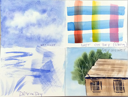 |
AuthorI have been an artist and craftsperson all my life. I have lived in Willits for over 30 years and am very active in the art community. I have been the recipient of several arts grants and artist residencies in the local schools. I have been teaching watercolor for Mendocino College for 16 years. Archives
April 2021
Categories |
 RSS Feed